Report Turnover Pie Chart
From Fishbowl Advanced
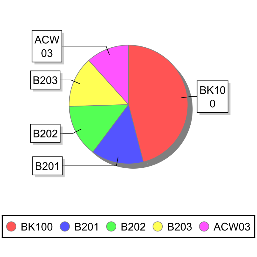
This report displays a pie chart that shows how many times inventory is turned over during the given date range. Products are displayed from greatest turnover to least turnover.
The  Modify Report button allows the following report filters to be customized:
- OPTIONAL TAB
- Location Group - Choose a location group to view turnover for. Leave this field blank to view data for all location groups.
- Part Number - Choose a part number to view turnover for. Leave this field blank to view data for all parts.
- Parts To Show - Enter the number of parts to show in the bar graph.
- Date Range - Enter the desired date range to see turnover information for. The date range looks at the DateLastFulfillment on the SOITEM table in the database, meaning, if a line item with a quantity greater than 1 is partially shipped, the most recent fulfilled date (when a partial quantity was shipped) is what will be used for all quantity fulfilled so far. It also looks at the EventDate on the INVENTORYLOG table in the database, meaning the date an inventory transaction occurred, such as a receipt, cycle, or scrap.
- Format Report for Exporting - Removes the page breaks and displays the report on one long page for exporting to CSV, Excel, and other formats.
- PRINTER TAB - Allows a default printer to be specified for the report in each location group.