Forecast
![]() The Forecast module, located in the
The Forecast module, located in the ![]() Reporting group, is an add-on module that can be installed from the
Reporting group, is an add-on module that can be installed from the ![]() Plugin module. After installing the plugin, a new module is added that uses historical data to forecast future sales, quantities, and costs.
Plugin module. After installing the plugin, a new module is added that uses historical data to forecast future sales, quantities, and costs.
Install
The documentation on this page is for the most recent version of the ![]() Forecast plugin. To get the most recent version, Update Fishbowl.
Forecast plugin. To get the most recent version, Update Fishbowl.
- In any Fishbowl Client, open the
 Plugin module, located in the
  Integrations group.
 - Select the
 Forecast plugin and click Install.
 - Completely close all Fishbowl Clients.
- Exit the Fishbowl Server by right-clicking the Fishbowl Server tray icon and selecting Exit.
- After re-opening the Fishbowl Server, the admin user can access the Forecast module from any Fishbowl Client by opening the
 Reporting group.
 - To grant access to additional users, assign the Forecast-View access right to the appropriate groups in the
 User Group module.
Filters

The Filters pane is used to select the data used for forecasting, the date range, and the type of chart.
- Display Data - Select the type of data that will be analyzed and forecast:
- Sales - Uses the price of inventory that has been sold.
- Quantity - Uses the quantity of inventory that has been sold, scrapped, and consumed on work orders.
- Cost - Uses the cost of inventory that has been sold.
- Part - Select the part that will be used for forecasting. Leave the field blank to include all parts.
- Location Group - Select the location group that will be used for forecasting. To include all location groups, select <All> or leave the field blank.
- Combine Location Groups - If checked, the location groups will be combined into one line on the chart.
- Formula - Below are some common uses for each formula. For more information, hover over an image, click an image, or click a link.
- Constant Average - Draws a straight line using the average or mean of the data.
Example: This formula may be helpful when the future is likely to follow a constant historical average.
- Linear Regression - Draws a straight line through the "middle" of the data points.
Example: This formula may be helpful when the future is likely to follow a long-term trend.
- Exponential Moving Average - Draws a wavy line that reacts to each data point. This allows the most recent trends to strongly affect the forecasted line.
Example: This formula may be helpful when the future is likely to follow the most recent trends.
- Constant Average - Draws a straight line using the average or mean of the data.
- Growth - Includes an additional growth percentage adjustment to the forecasting.
- Date Range - Select the historical date range that will be used in the calculation and the future date range to forecast.
- The dates can overlap to achieve overlapping lines on the chart. Changing the forecast start date will not affect the outcome of the forecast line, except when using Constant Average & Accumulation. In this case, since the accumulation begins on the forecast start date, the dates should overlap to continue forecasting the total for the current period.

To reset the total and start forecasting for a new time period, the dates should not overlap.
- The dates can overlap to achieve overlapping lines on the chart. Changing the forecast start date will not affect the outcome of the forecast line, except when using Constant Average & Accumulation. In this case, since the accumulation begins on the forecast start date, the dates should overlap to continue forecasting the total for the current period.
- Chart Type - Below is a description of each chart type. For more information, hover over an image, click an image, or click a link.
- Line Graph - Shows fluctuation by connecting the data points with a line.
Example: This chart type may be helpful when comparing time intervals (this month vs. last month).
- Accumulation - Shows the running or cumulative total by adding each data point to the previous total.
Example: This chart type may be helpful when looking at total calculations (MTD, YTD, etc.).
- Scatter Plot - Shows the same data points as the line graph but without the line.
Example: This chart type may be helpful when used with overlapping dates so that the data points can be easily compared to the forecasted line.
- Line Graph - Shows fluctuation by connecting the data points with a line.
- Group By - Select the time interval displayed on the graph: Day, Week, Month, or Year. Changing the time interval can have a large impact on the forecast line because it changes the data points. This is especially true when using Exponential Moving Average. Changing the interval will also affect which average is displayed when using Constant Average & Line Graph. For example, a daily average vs. a monthly average.
- Save filters - Use the buttons at the bottom of the Filters pane to load and save the filters.
Forecast combinations
By combining different formulas, chart types, dates, and intervals, many combinations are possible. Below are several possible combinations. To achieve overlapping lines, set the Forecast Date to include the Reference Date. For more information, hover over an image, click an image, or click a link.
| Line Graph Blue dots are connected |
Accumulation Running total |
Scatter Plot Blue dots are not connected | |
| Constant Average No trend. Straight line using the average (mean) of the data. |
Actual quantity with line Average of the quantities |
Actual quantity as running total Average compounded as running total |
 Actual quantity without line Average of the quantities |
| Linear Regression Overall trend. Straight line through the "middle" of the data points. |
Actual quantity with line Straight trend line for quantity |
 Actual quantity as running total Straight trend line as running total |
 Actual quantity without line Straight trend line for quantity |
| Exponential Moving Average Recent trend. Wavy line that reacts to each data point. |
 Actual quantity with line Wavy trend line for quantity |
 Actual quantity as running total Wavy trend line as running total |
Actual quantity without line Wavy trend line for quantity |
For mathematical descriptions of the formulas, see Constant Average, Linear Regression, and Exponential Moving Average.
Chart
- The chart can be zoomed and dragged using the mouse.
- Hover over a data point to see the corresponding data.

Customize tables
The tables in the ![]() Forecast module can be customized in several ways. Customizing the tables does not change the chart, but it does affect the data that is exported.
Forecast module can be customized in several ways. Customizing the tables does not change the chart, but it does affect the data that is exported.
- Columns can be dragged, sorted, and hidden.
- The table can be filtered by clicking on the right side of any column header.

- Click (All) to select or unselect all entries.
- Click an individual entry to show or hide it in the results.
- Click (Custom...) to add a custom filter to the results.

- Click the
 Export to .xls button or the
  Export to .csv button to export the data that is currently in the table.
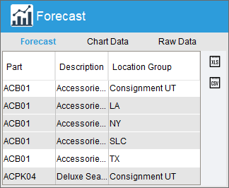
- To copy a single row, click the row and then press Ctrl + C.
- To copy all rows, press Ctrl + A and then press Ctrl + C.
- To copy consecutive rows, click and drag the mouse over the rows and then press Ctrl + C.
- To copy non-consecutive rows, hold down the Ctrl key while clicking each row and then press Ctrl + C.


TABS

- The Forecast tab displays the forecast for the part(s) included in the filter.
- Data in the table can be sorted, filtered, copied, and exported.

- The Chart Data tab displays the details for the data points on the chart.
- Data in the table can be sorted, filtered, copied, and exported.

- The Raw Data tab displays the raw data used in the forecasting calculation.
- Data in the table can be sorted, filtered, copied, and exported.